Visual weight is an often overlooked but essential component of your photos. It affects how your photos are viewed and is the driving force behind your composition.
It is the force that grabs your attention in an image but is often overlooked by photographers. Each element in the image has a different visual weight. Thus, the different components of a picture act against each other. Everyone is vying for attention. In other words, we notice some things before others. That’s why we compose photos in specific ways and decide what elements we put into the frame to ensure balance, flow, rhythm, and hierarchy. If we want to have compelling pictures, we can use our knowledge of visual weight to dictate how the viewer should read them.

It is not known exactly why we perceive some elements to have more visual weight and attract our attention more easily than others. However, different elements will differ in their ability to attract attention.
Colors have different visual weights. Yellow is considered the lightest, and red is the heaviest. Orange, green, blue, and purple are among the colors in order of increasing weight.
However, there is more to it than color. Increased saturation also gives greater image weight. So, if we place a dark object in the middle of a light background, that bold object exerts a greater force and our eyes are drawn towards it. Likewise, brightness also changes the image weight. Darker tones are heavier and show more power to grab our attention.
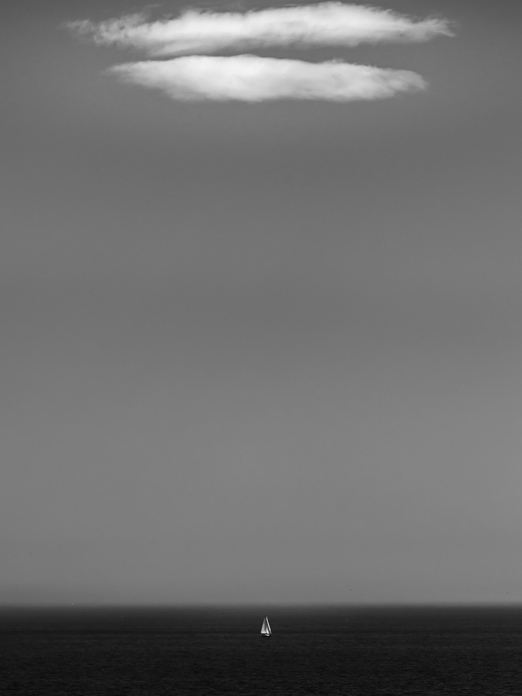
Although we often think of objects with more visual weight to draw our gaze, this is not necessarily the case. Contrast can work. Light tones can stand out against a dark background, and that will be the first thing we notice.
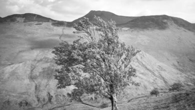
Proportion also affects visual weight. Our mind believes that a large object weighs more than a smaller object. However, considering the previous factors, a larger, lighter-toned object may carry less visual weight than a smaller dark object. Likewise, a group of compact objects has more weight if the constituent parts are more widely dispersed, just as denser objects weigh more than loose and liquid objects.
We often consider simplicity essential in a photograph. Our eyes are drawn away from negative space to more complex elements. Thus, more complex areas of a picture have more visual weight. This is because the mind takes longer to process its information.
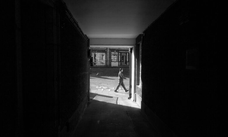
There is visual weight that we apply because of our psychology. We are attracted, perhaps more strongly than any other factor, to the people in an image. In portraits, it is their eyes that attract us. Likewise, animals are easier to attract our attention than inanimate objects.

As I mentioned earlier, visual weight is what we are considering when trying to balance a photo. Balance is achieved with equal weight on either side of a shaft. In its simplest form, symmetry achieves this, with one side of the axis reflecting the other. If you recall the set of scales you used in elementary school, a heavier weight near the fulcrum can be balanced against a lighter weight farther away from it on the other side. Similarly, different image weights can be offset by their relative distances from the axis.
One important thing to remember is that we don’t need to balance a photo with equally weighted elements. For example, a complex subject can balance a simple, dark red subject, a human being can balance a multitude of birds, or a giant white balloon can balance a small basket. and dark hangs below it.
We are used to seeing the world around us as influenced by gravity. Heavier objects are on the ground while the sky is brighter above. In photography, there is often a similar interest. But a heavier object above moving into a lighter area below can also work.

Flow is the ease with which our eyes move around the photograph. We use the visual weight of the elements to determine the order in which we view the image and where we pause.
We first see essential information in a picture and then move on to other, less important elements in order of importance. This is what is called the hierarchy in the image.
 Rhythm is used a lot in photography. We look for repeating patterns in shapes, colors, textures, tones, etc. Sometimes we are satisfied with that. Then the sample has equal weight over the whole image. However, we can also interrupt it. Therefore, that discontinuity has greater visual weight.
 This abstract idea of weight is not limited to vision. We think of leather as having a deep or heavy smell, while we think of a light lemon scent. High notes are said to be lighter than low notes. We intuitively know that the red, the smell of soy sauce, the taste of Merlot, and the low notes of a Beethoven symphony have invisible things in common.
 In addition, emotions can vary from mild, such as joy and surprise, to severe anger and depression.
This concept of weight is applied to various sensory experiences that are not limited to English-speaking cultures. I talked to friends in many different first languages about it. Many but not all have the same abstractions. Sometimes they use a word that can be more literally translated as depth, strength, or intensity, but others fail to recognize the concept of sensory weight. Is visual weight part of human psychology? Or is it cultural and associated with language? Some of the other aesthetic aspects of photography and art are cultural, so it will be interesting to explore this further.

Of course, this short article just touches the surface of this fascinating topic. Furthermore, a lot of consideration needs to be taken when taking pictures. More research is needed on visual weight and analyzing how elements work in your and other people’s photos. This trains your eyes. Applying these techniques and taking advantage of visual weights will eventually happen automatically.
It would be great to hear your thoughts on this topic. Especially if your native language is not English and you come from a completely different culture than mine. Is the weight of different colors, smells, tastes and sounds consistent with what is described above? Or you don’t have that concept at all.
Thank you for reading, and I hope you join the discussion below.
If you liked this, please read my previous related articles on emotions in photography and my discover what kind of photographer you are.