A Technical Note by Dr. Alan Welch FRAS, FBIS — 20 July 2024
LONG ESSAY WARNING: This essay is long and technical, 3300 words. Dr. Welch provides a summary for those less interested in the details of his analysis.
Summary Three representative graphs for Global Temperatures, Sea Level Rises and El Niño Indices were selected and analysed to see if there were any correlation between them. The Temperature and El Niño have large definite variations whereas the Sea Level has deviations from a fitted curve that are relatively small leading to a debate as to whether the variations are noise or have a significant meaning.
A method of making each graph dimensionless (called throughout this note, rightly or wrongly, normalisation) is employed and the three normalised graphs compared in pairs visually and numerically. Many of the graphs are rather “busy” and the 3 figures 11A, 16A and 18A, are added to show more clearly the main findings.
The main conclusions are that there are common patterns of behaviour between all three graphs, especially when a “phase shift” is applied to the Global Temperatures and that the Sea Level Rises are well represented by a linear line plus a sinusoidal variation of about +/- 4 mm over a 26-year period.
The main reason for this study was to supplement my understanding of Sea Level Rise variation and the involvement of Temperatures and El Niño Indices is solely to aid this. Having said that my knowledge of how El Niño Indices are formulated and how they may interact with other phenomena is sparse and if any commenter could elaborate on this, I would be grateful. I see a “chicken and egg” scenario between El Niño indices and values of Temperature and/or Sea Level but may have missed some fundamental point.
Finally, I have taken the liberty to add an “Epilogue” that summarises my 6-year journey in studying sea level rises and pulls together my findings in one graph, Figure 19. Assuming I remain compos mentis, I intend to review each future year to show what changes have occurred and how my predictions pan out.
———————————————————————————–
The main purpose of this Technical Note is to see if comparing the Sea Level Rise graph with other climatic graphs throws any light on the how the variation in Sea Levels from the long-term trend line may be judged.
Every month the UAH Temperatures are reported by Dr. Roy Spencer on WUWT. This reports the “Global” Temperatures monthly starting in 1979. The data are available on https://www.nsstc.uah.edu/climate/. Below, Figure 1, is a recent plot of temperatures.

Figure 1
Also, on a less regular basis the Sea Levels are reported by NASA with data being presented at 10-day intervals. The data are available on https://climate.nasa.gov/vital-signs/sea-level/. Again, a recent plot, Figure 2, is shown.

Figure 2
At first glance they look like the proverbial chalk and cheese and there seems no correlation between the two graphs. The Temperatures have a small slope with relatively high variations the form of which is readily accepted and is like many other Thermal graphs. On the other hand, the Sea Levels have a steep slope with small variations which, given the quoted accuracies of measurement (Ref 1), could be taken more as “noise” in the data. To perform a comparison, the following procedure was followed.
First the data for the 31 years from January 1993 to December 2023 were extracted from both data sets and a linear line fitted. Next the residuals obtained from extracting the values on the linear line from the actual values were obtained. These two sets of data were normalised so that the values fitted between -1 and +1 and the two sets of normalised data plotted together. ( The use of the term “normalised” needs to be checked as to its appropriate use but will be used when applied in all the subsequent work. ) The normalisation process consisted in obtaining the minimum residual (MIN) and maximum residual (MAX). Next select the largest absolute value of MIN and MAX calling it ABS. Then divide all the residuals by ABS. The term normalised is used as the outcome are sets of dimensionless values that are contained between the 2 limits of -1 and +1. Note for both sets of data residuals based on a quadratic fit were also determined and in the case of the sea levels residuals based on a sinusoidal variation of +/-4.2 mm over a 26-year period were also pursued. This variation was introduced in Ref 2 and following queries in the comments on the paper that followed was investigated as to its origin in Ref 3. The general forms of these differed little from the linear fit calculations so the intermediate details are shown solely on the linear fits. Also, a linear fit could be considered less controversial.
Three plots are shown for each of the sea level data (Figures 3 to 5) and the temperature data (Figures 6 to 8). These are respectively the data with a linear regression line fitted, the residuals obtained by subtracting the linear line values from the actual values and the normalised values. The second and third graphs (figures 4 and 5) are exactly the same shape but with the third graph fitting between -1 and +1.

Figure 3 – Sea Level data with Linear fit line
Subtracting the linear line values from the actual values results in the next graph.

Figure 4 – Sea Level Residuals
The relevant values to create the next graph are Min = -13.389, MAX = 11.21715 and ABS = 13.389.

Figure 5 – Normalised Sea Level Residuals
The same process is applied to the Global Temperature Data.

Figure 6 – Temperatures with Linear fit line
Subtracting the linear line values from the actual values results in the next graph.

Figure 7 – Temperature Residuals
The relevant values to create the next graph are Min = -0.48963, MAX = 0.733408 and ABS = 0.733408.

Figure 8 – Normalised Temperature Residuals
Figures 9 to 11 show comparisons of normalised graphs of Global Temperature and Sea Level Residuals as measured from a range of fitted curves. The three figures are for
Linear line for both sets of data
Quadratic fit for both sets of data
Quadratic fit for Temperatures and Sinusoidal fit for Sea Levels.

Figure 9 – Comparison of Normalised values (Linear Fit)

Figure 10 – Comparison of Normalised values (quadratic Fit)

Figure 11 – Comparison of Normalised values (sinusoidal fit for sea levels)
Figure 11 is rather busy so to visualise the trends better it is replotted in figure 11A as 13-month averages. (This presentation is also applied to figure 16 and 18)

Figure 11A – Comparison of Normalised values (sinusoidal fit for sea levels)
13 Month Average
There is a general similarity over all three sets although the latter two do show an improvement except for the peak in Temperature at year 5 and the dip in Sea Level at year 6. In ref 4 it was pointed out that around this period major changes to data occurred with the Topex data which may just be a coincidence. It would be informative to apply a check like R Squared between the pairs of data but there are about 3 times more sea level data points, so this is ruled out at this stage.
Another check that can be made is with a normalised graph of the El Niño Index. The El Niño Index data was obtained for the period 1990 to 2024 and is shown in figure 12. The data are on a monthly basis, so this opens up the possibility of more numerical comparisons.

Figure 12
The data for the period 1993 to 2023 were extracted and as the linear fit was basically the zero axis the El Niño Index values were taken as the residuals and normalised as they are. There is a small positive curvature, but this is ignored.
The relevant values to create the next graph are Min = -2.03, MAX = 2.64 and ABS = 2.64.
The normalised plot is shown below.

Figure 13 – Normalised El Niño Indices
The El Niño Index normalised values were then compared with the various Temperature and Sea Level normalised values.

Figure 14 – Comparison Normalised Values Temperature and El Niño (Linear)

Figure 15 – Comparison Normalised Values Sea Level and El Niño (Linear)

Figure 16 – Comparison Normalised Values Temperature and El Niño (Quadratic)
The Linear and Quadratic plots for Global Temperatures are not too dissimilar so a 13-month moving average version of figure 16 is shown below in figure 16A.

Figure 16A – Comparison Normalised Values Temperature and El Niño (Quadratic)
13 Month Average

Figure 17 – Comparison Normalised Values Sea Level and El Niño (Quadratic)

Figure 18 – Comparison Normalised Values Sea Level and El Niño (Sinusoidal)
The Quadratic and Sinusoidal plots for Sea Levels are not too dissimilar so a 13-month moving average version of figure 18 is shown below in figure 18A.

Figure 18A – Comparison Normalised Values Sea Level and El Niño (Sinusoidal)
13 Month Average
The main conclusions from these 5 plots are that the Temperature and Sea Level variations match the El Niño variation more closely than when they are compared with each other. The Temperature variation lags about 4 months behind the El Niño variation. Having said that the latest El Niño seems to buck this trend, but it is still in operation and judgement needs to be deferred. Of the comparisons the case of a quadratic fit is best for the Temperatures whereas the sinusoidal Sea Level fit is considered best for the Sea Levels although there is not much in it.
Another mathematical way of looking at the fits is to calculate the R Squared values between various sets of results. The Temperature and El Niño values are monthly, but the Sea Levels are every 10 days. An averaging process was applied to the Sea Level data as follows. If the year contained 36 sets of data, these were averaged in triplets to give 12 monthly values. If there were 37 sets again triplet averaging was applied except for the 6th month when it was averaged over 4 sets of data. Linear and Quadratic curve fits were applied to the reduced data set and found to agree with the full data set to at least 2 significant figures.
Table 1 below lists all the R Square values but those of initial interest are those involving the El Niño values, that is the last column.

Table 1 – R Squared values for various pairs
For the temperature data the R Squared values are poor and very little difference between linear and quadratic fits. If the temperature data is progressively moved over a month at a time the best result is found with the quadratic fit and a 4-month shift, similar to a phase shift, giving a R Square value of 0.410, compared with 0.138 if no shift is applied (Table 2). The best R Squared value for the linear fit is 0.399 again with a 4-month shift (Table 3).

R Squared values for Temperatures
For the Sea Levels the best R Square is for the sinusoidal curve at 0.481 although a 1-month shift improves this slightly to 0.492 (Table 4). If linear or quadratic fits are considered the best R Squared values are again roughly with a 1-month shift at 0.298 and 0.454 respectively (Tables 5 and 6).

R Squared values for Sea Levels
The main conclusions are:
1) The normalised data for Temperature, Sea Levels and El Niño Indices tend to be closely related. (Figure 11A).
2) The Temperature and Sea Level normalised data match the El Niño values more closely than with each other. (Figures 16A and 18A).
3) The variation in Temperature values tend to appear about 4 months after the other two sets of values. (Tables 2 and 3) with the Linear and Quadratic fits being very similar.
4) The variation in Sea Level variation is not therefore due to “noise” but is accountable for by showing similar behaviour to the Global Temperature variation and the El Niño Indices variation.
5) The use of a sinusoidal variation in residuals of about +/- 4mm over a 26-year period leads to a better correlation. (Table 4). It is slightly better than the Quadratic fit but greatly improved over the Linear fit.
6) Unfortunately climate changes occur too slowly, and 30 years of data is much too short to judge finally between the Quadratic and Sinusoidal fits or Sea Level changes but hopefully the next 10 years will bring a closure to this part of the debate.
References
- Jason-3 Products Handbook [.pdf]
- https://wattsupwiththat.com/2023/05/02/30-years-of-measuring-and-analysing-sea-levels-using-satellites/
- https://wattsupwiththat.com/2024/04/06/measuring-and-analysing-sea-levels-using-satellites-during-2023-part-2/
- https://wattsupwiththat.com/2024/03/21/measuring-and-analysing-sea-levels-using-satellites-during-2023/
————————————————————————————————————
Epilogue (2018 to 2024)
6 years ago, I was a typical UK retired engineer, cutting my grass, listening to the BBC and reading the Guardian. One day the last two highlighted a news item concerning “accelerating sea level rises”. I quickly found the source, the Nerem et al paper of 2018, which used quadratic curve fitting over 25 years and extrapolation over 80 years which frightened the life out of all the children and anyone living near the sea. Any Engineer worth his/her salt would cringe at such mathematical manipulation. Any extrapolation of polynomials would be viewed with suspicion. Any Scientist likewise should tread carefully. But Climate Scientists seem to have a law unto themselves and plough on regardless.
Not knowing anything about Climate Science I started my own investigation and wrote a short, be it a bit rough round the edges, paper which I submitted to PNAS. It was turned down at the peer review stage. Hence my involvement with WUWT and with much help and encouragement from Kip Hansen have produced six papers over the last two years or so. These were generally individual papers but over time a consistent message appeared. That was that there may be an alternative curve to the quadratic fit, with its perceived “accelerations”, namely a sinusoidal variation.
The first paper (https://wattsupwiththat.com/2022/05/14/sea-level-rise-acceleration-an-alternative-hypothesis/) introduced a sinusoidal curve and showed over time that it could match the variation in “accelerations” with time and that these “accelerations” would decay over decades with the appearance of a decaying sinusoidal curve.
The second paper (https://wattsupwiththat.com/2022/06/28/sea-level-rise-acceleration-an-alternative-hypothesis-part-2/) showed why 25 years was far too short a time scale to fit a quadratic curve and that 50 or even 100 years was really needed to obtain any meaningful values.
An analysis of the first 30 years of satellite readings was carried out in the third paper (https://wattsupwiththat.com/2023/05/02/30-years-of-measuring-and-analysing-sea-levels-using-satellites/) and the sinusoidal curve modified slightly to a +/-4.2mm amplitude over a 26 year period.
Following the 30-year review the next year, 2023, was analysed, a year in which a relatively large El Niño event started (https://wattsupwiththat.com/2024/03/21/measuring-and-analysing-sea-levels-using-satellites-during-2023/). Also, major, but unaccounted for changes, had been made to 30+ year old data which modified some detail but not the overall trends in “acceleration”.
The fifth paper (https://wattsupwiththat.com/2024/04/06/measuring-and-analysing-sea-levels-using-satellites-during-2023-part-2/) addressed the legitimate question of why the identified sinusoidal curve may be present. The combination of the 66-degree inclination of the satellite orbit and a decadal oscillation up the North Atlantic/Arctic Sea corridor were investigated and found to be a possible cause. It was a case of what was not measured that was important.
This current paper addresses whether the small deviations in sea level data are noise or meaningful. In so doing it also strengthens the suitability of the sinusoidal variation in levels.
It is now a wait and see scenario. Nature moves at a slow pace at times. I intend, assuming the pills keep working, to analyse each complete year as it comes. 2024 will see the demise of the El Niño and a return to normal service with the “accelerations” predicted to return to a downwards trend during the year. An interesting graph will be the plot of sea level residuals from the linear fit and how these compare with the quadratic and sinusoidal curves.
I’ve enjoyed the comments made, be they praise or criticism, learnt much about Climate Change in the process and hope to have contributed something to the understanding of the science involved.
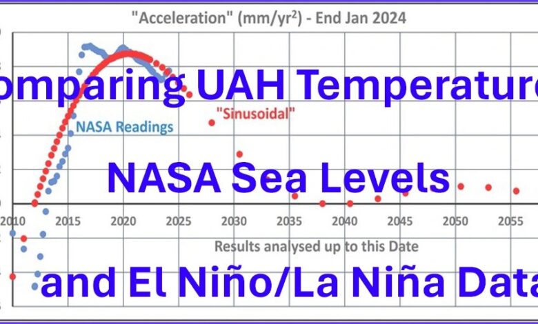
Finally, one graph (Figure 19) showing how the actual and predicted “accelerations” vary with time encapsulates much of my findings.

Figure 19
It shows
– The variation of “accelerations” as calculated by the Method in Nerem et al’s paper of 2028 – labelled “NASA Readings”.
– How the El Niño and La Niña phenomena cause oscillations in values of “acceleration” about a basically smooth curve.
-How the variation of “accelerations” based on a sinusoidal variation of residuals (differences between actual sea levels and a straight line) echo the variation of actual values.
– Predicts a gradual reduction in “accelerations” over the next decade or so approaching values measured with long term (greater 100 years) Tidal Gauge readings.
– Both curves peak at just below 0.10 mm/year2 around 2020.
– Not shown fully is that actual values of “acceleration” prior to 2012 are erratic due to the El Niño and La Niña phenomena causing much more variation over the shorter time scales involved.
– The Graph has been extended to 2060 to cover more than 2 cycles of the predicted 26-year sinusoidal variation. Remember the curve labelled “Sinusoidal” is not a sinusoidal curve but the resulting more complex curve of calculated “accelerations”.
– The Graph converges to the zero-acceleration line but in reality, it may converge to a small positive acceleration similar to the long-term Tidal Gauge of about 0.01 mm/year2. Its form is of a slightly under-damped oscillation.
– Also, the year 2060 is important to me as Halley’s Comet should becoming visible for its next return and I plan to see it. I will only be 122(!) and hope I can turn my head up enough to see it! Make a date in your diaries.
————————————————————————————————————-
(Health Warning – Between the first and last drafts of this Technical Note I suffered a stroke which put me in a stroke unit for over a week. Consequently, the combination of this, being 86 and the unsociable Time Differences means I may be slower in responding to any comments. — aw)
————————————————————————————————————-
Comment from Kip Hansen:
Dr. Welch has been working on these analyses for years and this is his latest effort. This and his five previous essays on the topic (linked in the essay and in the references) are offered here by Dr. Welch as an alternative hypothesis to Nerem (2018) ( .pdf ) and Nerem (2022). [ In a practical sense, Nerem (2022) did not change anything substantial from the 2018 paper.]
On a personal note: This is not my hypothesis. I do not generally support curve fitting and an alternate curve fitting would not be my approach to sea level rise. I stand by my most recent opinions expressed in “Sea Level: Rise and Fall – Slowing Down to Speed Up”. Overall, my views have been more than adequately aired in my many previous essays on sea levels and their rise or fall here at WUWT.
I find Dr. Welch’s analyses interesting and feel strongly that Dr. Welch’s analyses deserve to be seen and discussed. I have encouraged him to present his findings here at WUWT.
On that note: I am always willing to receive your work as well for review. I promise not to be overly kind — in fact, I will be honest — which may not be what you are looking for. If I think your work has merit, I will encourage you to whip it into something publishable at WUWT. If I think it stinks, I will still encourage you to keep at it ‘til it shines (which may require abandoning your favorite-but-nutty hypothesis altogether). You may write me with your ideas at my first name at i4.net.
Note that Dr. Welch lives in the U.K. and his responses to comments on this essay will be occurring on British Summer Time : UTC +1 – and please take into account his health warning above.
# # # # #
Related
Discover more from Watts Up With That?
Subscribe to get the latest posts sent to your email.