Be sure to vote in the poll below; but first, let’s take a look at the case designs.
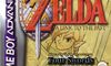
North America
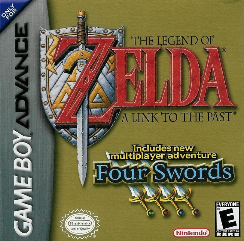
The North American version is classic Zelda box art: clean yellow background with only the A Link to the Past and Four Swords logos taking up space. Honestly, if every Zelda game was a variation of this approach, we’d have no problem with it. Sadly, modern marketing means there has to be at least one or two characters emblazoned on the front cover. Sigh…
Europe
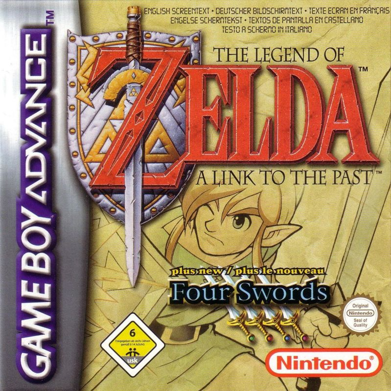
The European design is very similar to the North American one, but this time, instead of a solid yellow background, the overall contrast has been lightened significantly and an image of Link himself has been added to break things up a bit. Both logos have been slightly altered to make room for the image, with the Four Swords logo being significantly reduced in size. We like this logo, though, despite our previous complaints about the character’s inclusion.
However, we can ignore all the text at the top of the page.
Japan
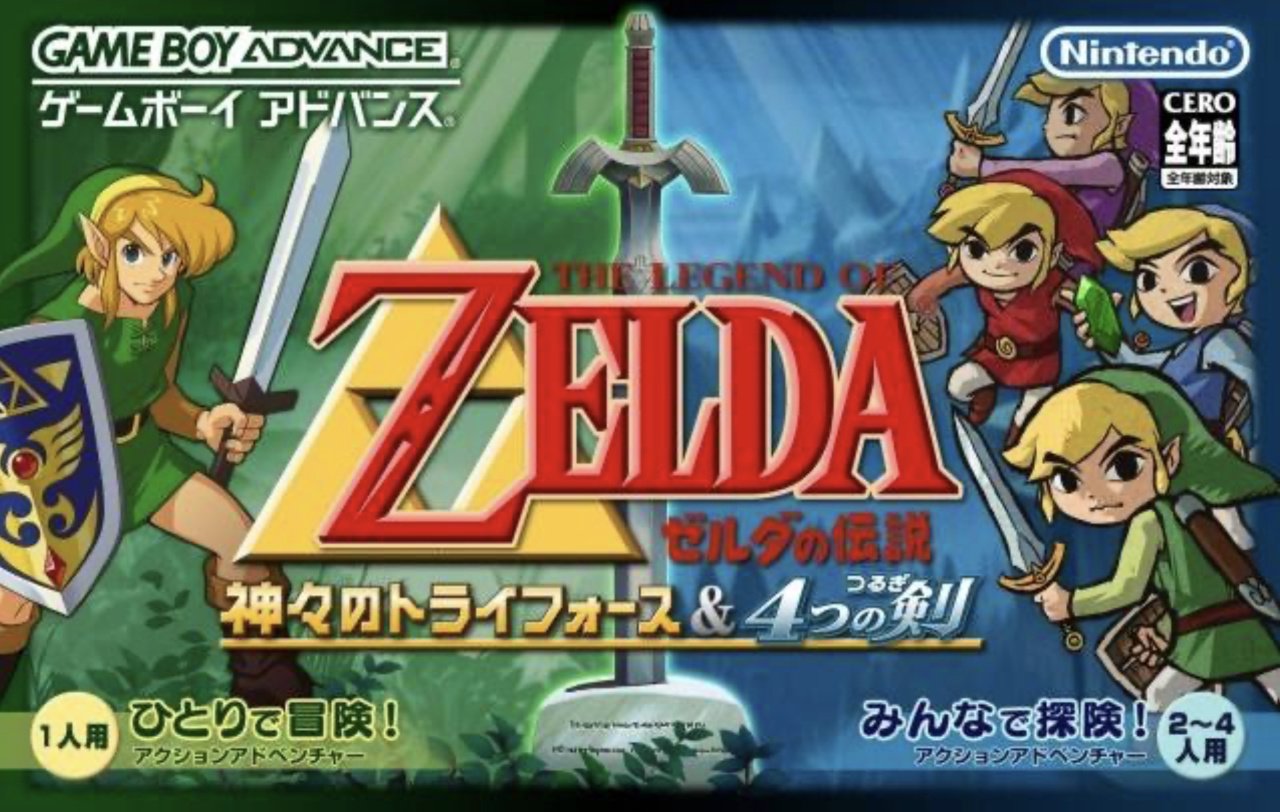
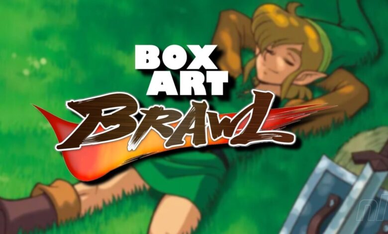
We dare say, Japan may have really gotten the short end of the stick with this one. Normally, landscape orientation allows for some stunning artwork, but this is just a little busyRight? We like the contrast between the green and the blue, and the Master Sword in the middle makes it nicer, but there are too many Links. All the Links.
Thanks for voting! We’ll see you next time in another round of Box Art Brawl.