by E. Calvin Beisner
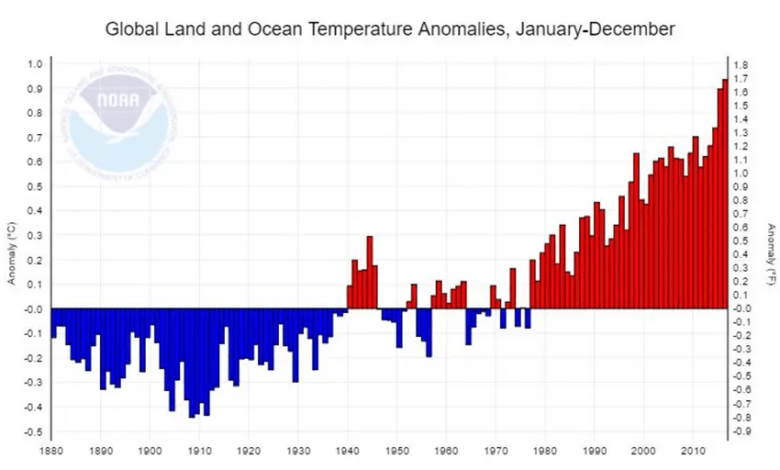
By now, almost everyone who follows the news and comments on climate change has seen graphs of global warming over the past century or so. The National Oceanic and Atmospheric Administration (NOAA) produced this in 2017, covering the period 1880–2016.

Since its first appearance, it has become one of the most commonly used terms, whether in scientific journals or government websites or news media or blogs or social media. More recent data is often communicated in a similar way—and it’s not hard to see why.
Here, solid bars, one for each year, depict the change in global mean temperature (depicted as anomalies, i.e. deviations from year 20)th(century average), and the psychological impact is predictable: fear.
How? The early, below-average bars are a pleasant green; the later, above-average bars are an alarming red. If all the bars were the same color, the psychological impact of the different colors would be lost.
But color choices aren’t everything. They’re just the most obvious choices. Other choices are less obvious, and readers unfamiliar with how to interpret graphical representations (or misrepresentations) of data may not notice them.
Ominously, the longest blue bars almost reach the bottom of the chart, and the longest red bars almost reach the top. Why? Because the vertical axis chosen (and note that—it’s a solid choice) only covers the range from -0.5°C to +1.0°C (-0.9°F to +1.8°F). That’s a total of 1.5°C (2.7°F).
On the one hand, this makes sense. Enter raw numbers into a standard spreadsheet, ask it to generate a bar chart, and that, or something very close to it, is what you’ll get. And why not? After all, it contains all the numbers, from lowest to highest. What more could we ask for?
On the other hand, if your goal is to help people think rationally about global temperature change, then it’s completely indefensible.
Why? Because it makes a temperature change of less than 1.5°C (2.7°F) seem much more significant than it actually is to the untrained eye. After all, most people barely notice if the temperature in the room goes up or down that much. But on this vertical scale, the longest red bars are almost at the top, as if to say, “We’re almost there!” Yes, the longest blue bars are also almost at the bottom, as if to say, “Whoa! We just barely froze!” (And since cold snaps kill an average of 10 to 20 times more people per day than heat waves, that’s actually comforting—but I digress.)
But remember, blue is a pleasant color; red usually means “danger!” After all, that’s why United Nations Secretary-General António Guterrez called the first meeting of the Intergovernmental Panel on Climate Change Sixth Assessment Report “code red for humanity,” not “code blue” (although admittedly in hospitals, “code blue” denotes a patient’s critical condition—but that’s not common terminology).
And since most people read from left to right, this chart subtly conveys that, whatever risks might come with those low temperatures, we’re far behind them. There’s no need to worry about them right now. It’s those high temperatures, which are steadily rising, that we need to worry about.
Back in the early 1990s, when I was the managing editor of the book The state of humanityThe journal’s editor-in-chief, the late economist and statistician Julian L. Simon, famous for his opposition to misleading statistical charts, insisted that all data charts provided by the 58 authors (including eight Nobel laureates) used realistic and objective scales.
For example, a chart of data presented as percentages should have a vertical scale of a full 100 points—otherwise, the results can be very misleading. After all, if the vertical scale only increases from 80% to 90%, then a data point of 86% might represent a quantity twice as high as 83%, when in fact it is only 3.6% higher.
Another example: Data charts that don’t depict percentages should have a zero baseline. Or, if they depict both negative and positive data, the vertical axis should extend equally below and above zero, so that relative magnitudes are quick and easy to understand. Or, if they depict data that is so highly variable that the low numbers just disappear, they should be plotted on an exponential scale—and that fact should be communicated prominently—or with discontinuities clearly marked along the vertical axis.
There are other examples, but you get the idea. One of the basic principles is that the vertical axis should cover a really significant range.
That’s the bigger problem with NOAA’s famous chart. As we saw above, it makes a very small change in temperature seem much larger and more significant.
A more appropriate, less misleading way to graph similar temperature data is to use the fairly typical vertical range of weather that people experience. That’s the scale they’ll understand.
In the United States, except when a front rapidly moves a warmer (or colder) air mass from one place to another, the diurnal temperature range (daytime high to nighttime low) is typically about 5.6°C (10°F) in humid places but about 22.2°C to 27.8°C (40°F to 50°F) in arid to semiarid places. In other words, people are used to those temperature ranges.
It seems reasonable, then, to depict the global temperature anomaly data on a vertical scale, such as in the middle of the low and high ranges, i.e. 16.7°C (30°F). And to complete the avoidance of psychological scare tactics, we will remove the color scheme and use neutral colors.
What would NOAA’s data from 1880 to 2016 look like if plotted that way? Something like this:

Remember, this is the exact same data depicted in the NOAA chart. Is it creepy? No, but it’s a more honest, objective, unmanipulated representation of the data. So now you’re equipped to not be manipulated—and to enlighten your friends and neighbors.
Defenders of the scary way of describing the data might respond, “But the fact is that this small change in average global temperature, if continued on a large scale, will cause devastating changes in weather, sea levels, crop production, and other measures – changes that will impoverish humanity and possibly even lead to its extinction. So describing the scary facts in a scary way is exactly what we need.”
But the Intergovernmental Panel on Climate Change disagrees—firmly and resolutely. In 2018 Special report on global warming of 1.8°C concluded that if we do nothing to slow greenhouse gas-induced warming, the resulting warming will cause gross world product (GWP) in 2100 to be 2.6 percent lower than business as usual.
What if it doesn’t? The Center for Global Development says economic growth for the rest of the century will likely be around 3 percent per year. After taking into account population changes, that would result in a GWP per capita 8.8 times what it was in 2018.
When poverty is a much greater threat to human health and life than any factor related to climate and weather, does anyone think that the consequences are dire?
If you spend much time on social media sites where people often post text or images to make their point about controversial issues, you’ve surely seen a “fact check” stating that a post conveys “false or misleading information” because it “lacks context.” (That’s a judgment that’s often subjective and driven by the “fact checker’s” ideology, but we can ignore that for now.) What you now know is that when it comes to “lack of context” on climate change, official government agencies can be among the worst offenders, not just on social media but also on agency websites—where their products, like the NOAA chart reviewed here, regularly appear in scientific journals and mainstream media.
A Google image search on July 11, 2024 found NOAA charts at about 100 locations. Where are those “fact checkers” when we need them?
E. Calvin Beisner, Ph.D., is President of Cornwall Alliance for Creative Managementa Christian research group addressing environmental stewardship and economic development for the poor. He is also co-editor, with David R. Legates, Ph.D., of Climate and Energy: The Case for Realisma bestseller on Amazon.
Related